Dilution-proof, April 28, 2021
On January 3, 2009, Satoshi Nakamoto launched the Bitcoin network by mining the first block (the “genesis block”) in the Bitcoin blockchain. Today, a bit more than 12 years later, the network stores over $1 trillion in value and transfers more than $20 billion in on-chain volume on a daily basis. To get there, bitcoin went through multiple boom and bust cycles in which it was praised to the moon and declared dead many times over—every time to resurrect from the death. This process kept repeating in a roughly four-year cycle that led many to believe that there is a certain predictability to long-term bitcoin prices, of which PlanB’s popular Stock-to-Flow (S2F) model is the most well-known attempt.
In this article, we’ll first take an in-depth look at why the bitcoin price moves in a four-year cycle related to its halving schedule. We then dive into how this market cycle influences more fundamental properties of the Bitcoin network itself that are related to the behavior of miners and users. Finally, I introduce a hypothesis for how the maturation of the Bitcoin network itself will eventually extinguish its four-year cycle, and explain why this would be a good thing for the network and its users.
Bitcoin’s Fixed Supply Issuance Schedule
When Satoshi Nakamoto launched the Bitcoin network, there was a need to (1) bring the bitcoin units into circulation and (2) incentivize early users to actually participate in the network by running their own mining nodes to secure the network and gradually decrease the chances of a single entity attacking the network via a majority attack (or 51% attack).
To do this, Satoshi Nakamoto decided on a coin issuance schedule where Bitcoin network participants would receive a 50-bitcoin mining reward (also called “coinbase,” not to be confused with the eponymous exchange) per created block. Every 210,000 blocks (~4 year, assuming 10-minute block-intervals), this reward halves. After the first halving (November 28, 2012), miners received 25 bitcoin; after the second halving (July 9, 2016), 12.5; since the last halving (May 11, 2020), they received 6.25, and so forth.
By combining this coin issuance schedule with Adam Back’s ingenious proof-of-work mechanism, Bitcoin’s monetary policy regarding its supply (figure 1, blue line) and monetary inflation (figure 1, orange line) became set in stone on a per-block basis as soon as the network launched—unlike its central bank predecessors.

Figure 1: The bitcoin supply (blue) and monetary inflation (orange) over time.
Impact of the Halving on Supply, Demand and Price
Intended or not, the roughly four-year halving that has occurred three times in Bitcoin’s existence so far appears to have been a consistent trigger in pushing up the price every time. As can be seen in figure 2, after every halving event (white striped vertical lines), the bitcoin price (white line) has moved up dramatically in the year after those events. The average bitcoin price during a four-year moving window (black line in figure 2) has been positive during its complete lifespan as a result.

Figure 2: A logarithmic chart with the bitcoin price in USD and its four-year moving average.
Before each halving event, the bitcoin price is a dynamic equilibrium between
- the supply of newly mined bitcoin that enters the market;
- the demand for bitcoin by new market participants and recurring purchases;
- the degree in which that new demand comes from long-term HODLers that take the respective bitcoin off the market; and
- the degree in which increased market prices or other triggers entice existing long-term HODLers to increase the supply available on the market by selling bitcoin.
After the halving, the supply of newly mined bitcoin that enters the market is cut in half. If the demand for bitcoin remains unchanged, this means that a supply shortage is gradually formed. Since bitcoin’s supply is perfectly inelastic, this supply shortage cannot be solved by creating more bitcoin. As a result, the only way for the market to unlock supply to satisfy the demand for bitcoin is to entice current holders to sell their bitcoin—which means that the market price has to move up. Due to bitcoin’s status as a Veblen good, this rising price tends to attract even more demand, exacerbating the already existing supply shortage and driving up the price much faster than it organically would. Those price developments resulted in a temporary bubble each time that ended with a market crash and subsequent multi-month to multi-year bear market that was necessary for supply and demand to find a new equilibrium—each time at a (much) higher level than during the previous cycle.
This mechanism was brilliantly visualized by @Croesus_BTC in this tweet thread and is compiled in figure 3.
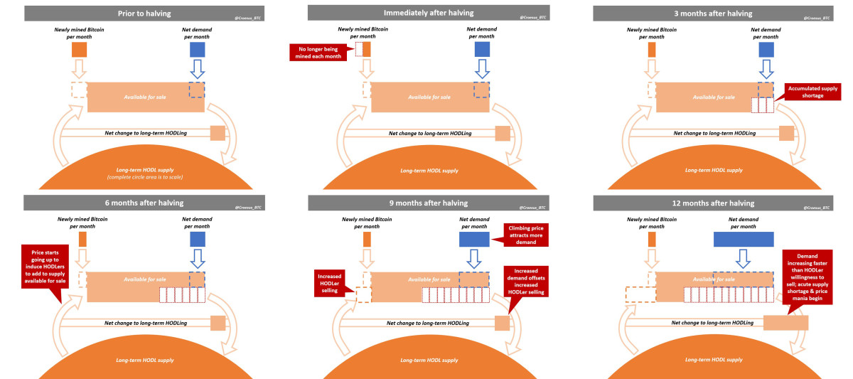
Figure 3: A visualization by @Croesus_BTC of how the halving creates a supply shock that drives up prices.
Although the post-halving price increases, the bitcoin price charts are already pretty distinct and the causal mechanism for such a cycle to exist is quite self-evident; it is nice to get more robust evidence for the notion that the bitcoin price indeed moves in a four-year cycle. In this published article on April 15, 2021, @btconometrics performed a Fourier analysis to prove that this is indeed the case. Although the statistical methods used are relatively complicated and explaining them is beyond the scope of this article, the graphical representation of the results is actually straightforward to interpret. As can be seen in figure 4, the highest values are reached very close to the red line that represents the four-year cycle, illustrating that the cyclicality in bitcoin is indeed very close to that.

Figure 4: The results of a Fourier analysis performed by @btconometrics, visually proving that the bitcoin price indeed moves in roughly four-year cycles.
The Bitcoin Price Temperature (BPT)
Now that we have insight into the mechanism that is driving bitcoin’s four-year cycles, we can take a more in-depth look at what this price cyclicality looks like. To do so, I have created a metric called the Bitcoin Price Temperature (BPT), which is described in detail here.
In short, the BPT is calculated by subtracting every daily closing price by the average bitcoin price during the previous four years, and then dividing that number by the price’s standard deviation during that time span. The result is a metric that reflects to what extent any historic bitcoin price deviates from its four-year moving average while taking its volatility into account, and, thus, how “hot” or “cold” the price is—hence the name, Bitcoin Price Temperature. By utilizing the bitcoin price’s standard deviation into the metric, the BPT metric adjusts for price volatility, unlike otherwise similar indicators like the Mayer Multiple.
The top chart in figure 5 illustrates the BPT. As shown, the bitcoin price has actually rarely been below its four-year moving average (the blue horizontal line at zero), and it has historically reached its four-year cycle tops at a price temperature of eight or higher. On a smaller time frame, the bitcoin price has also changed its bullish or bearish trajectory several times at temperatures of around two and six. While these levels have been determined based on a limited sample and thus need to be taken with a grain of salt, they are interesting price levels to monitor during bitcoin’s current and future four-year cycles—assuming those will continue to be similar to the past cycles, which will be discussed later in this article.
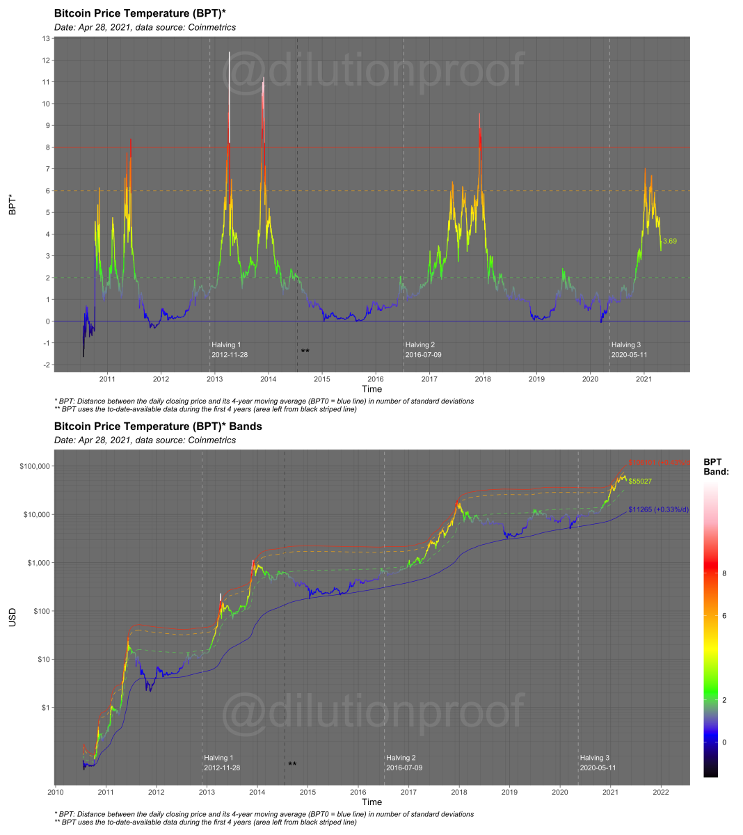
Figure 5: The Bitcoin Price Temperature (BPT) chart [top] and full bitcoin price history with BPT Bands overlay [bottom].
Another way to look at the cyclicality of the BPT and bitcoin price itself, is to “reset the clock” at every halving, creating a chart where the BPT and/or bitcoin price itself per cycle are overlaid, making them easier to compare. As can be seen in the top chart in figure 5, the price temperature gradually moves up after the halving at an increasing pace, historically creating a blow-off top circa 12 to 18 months after the halving, taking the remainder of the four-year cycle to cool off again and find an equilibrium somewhere around its four-year moving average.
The bottom chart in figure 6 illustrates the actual bitcoin price in United States Dollars (USD) with an overlay of the BPT and BPT Bands. Every time the price temperature reaches the cooldown period of its four-year cycle, the bitcoin price has found an equilibrium at a price level that is (at least) an order of magnitude higher than the previous cycle.
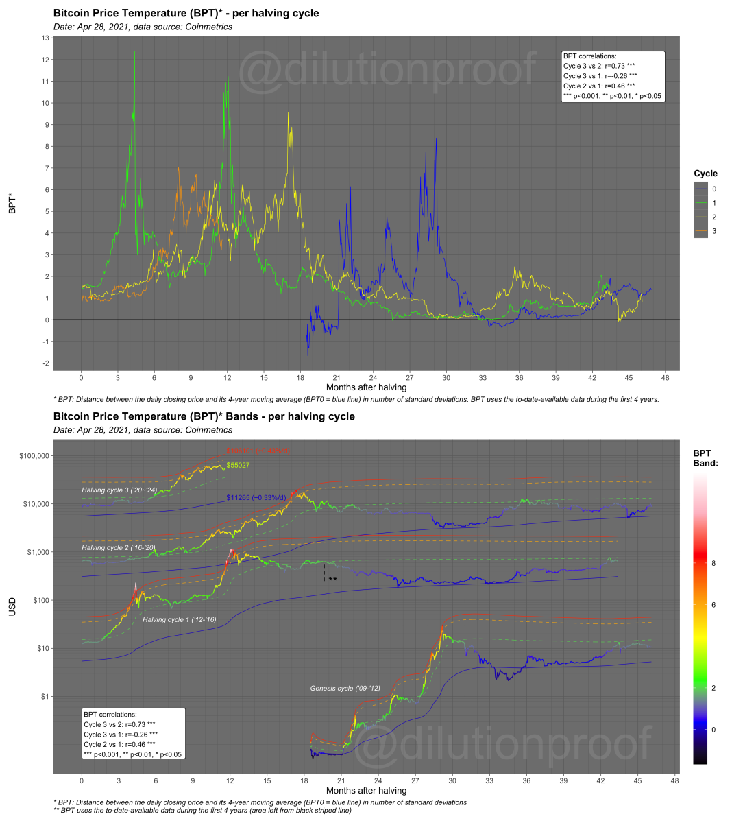
Figure 6: The BPT (top) and BPT Bands per halving cycle (bottom).
This is also why dollar-cost averaging (DCA) into bitcoin and HODLing it for the long haul (or at least four years) has historically been such an effective strategy. It doesn’t matter if you have bought the top or the bottom; as long as you have held onto your bitcoin for at least four years, you’ve historically done very well—without the additional costs of time, anxiety and in some countries (like the United States) tax burdens that come with active trading.
Impact of the Market Cycle on Bitcoin’s Hash Rate and Coin Issuance
In anticipation of each bitcoin halving, articles spreading fear, uncertainty and doubt (FUD) about something called ‘the mining death spiral’ start appearing. The mining death spiral FUD suggests that since the block subsidy is split in half, miners are faced with a 50% cut in their profitability, which will cause (some of) them to stop mining. In turn, this would make the network less secure, making it less valuable, making the price go down, further decreasing miner profitability, making them turn off more miners and so forth.
While it is true that in the short-term some miners are turning off hardware that is less efficient or running on more expensive energy, that dip is barely visible on long-term charts and ensures that the remaining mining activity on the network is actually very efficient and healthy. More importantly, that temporary dip is actually completely undone by the positive side effects of the halving-induced price increase that was described earlier.
As a result of the increasing bitcoin price following the halving-induced supply shortage, mining profitability increases again, incentivizing miners to (re)join the network. As a result, the network’s hash rate actually increases, making the network more secure and thus more valuable. This means that on a multiyear horizon, we are actually seeing the complete opposite of what the mining death spiral FUD suggests will happen—all thanks to bitcoin’s four-year cycle.
In figure 7, the almost continuously increasing hash rate of the Bitcoin network is illustrated. As can be seen, the hash rate barely drops after each halving (white striped vertical lines), and as the bitcoin price and thus the BPT measure that we introduced in the previous paragraph increases, hash rate growth accelerates. During the second half of the cycle, when price is cooling down, hash rate growth stagnates a bit—until the next halving occurs and a new market cycle incentivizes more rapid growth of this network characteristic that is so important for its overall security, actually making the network itself more valuable.

Figure 7: The Bitcoin hash rate, overlaid with the Bitcoin Price Temperature (BPT).
To ensure that new blocks are created every ~10 minutes (which is necessary to make the network relatively stable to transact on and that the supply issuance is actually spread out over time), the network has a built-in difficulty adjustment mechanism. Every 2,016 blocks, which is every ~14 days, the network makes it a bit easier to mine if the hash rate on the network is relatively low, or a bit more difficult to mine if the hash rate on the network is relatively high.
This means that during these periods of the cycle where the hash rate keeps going up, more new bitcoins are created than would be expected based on the original supply issuance schedule that assumes 10-minute block times. This inspired David Puell to explore the ratio of the daily coin issuance and the average daily coin issuance over the past year, which resulted in the Puell Multiple.
The Puell Multiple is displayed in figure 8, along with several levels that appear interesting based on visual inspection (which is subjective and should thus be taken with a grain of salt). As can be seen, the daily coin issuance takes an abrupt decline on the day of each halving, which is due to the halving of the block subsidy. In the months after, as price increases, mining becomes more profitable, a new hash rate floods onto the network, and the daily coin issuance ramps up again. When the bitcoin price growth stops and the market cycle finishes with a blow-off top that is followed by a cooldown period, mining profitability decreases, causing the daily coin issuance to go down again. The Puell Multiple is, therefore, regularly seen as an interesting indicator to monitor bitcoin’s cyclicality from an on-chain perspective.
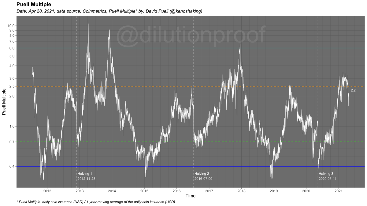
Figure 8: The Puell Multiple, a metric that quantifies to what extent the daily coin issuance is increased in comparison to the average daily coin issuance over the previous year.
Besides the hash rate growth and resulting temporary increase in daily coin issuance that are particularly indicative of cyclical miner behavior, the Bitcoin blockchain holds valuable information regarding another important group of market participants; those that use bitcoin to transact on-chain.
Influence of the Market Cycle on the Mempool and Transaction Fees
Intuitively, the first thing that you might think of to visualize the behavior of that group might be to create a chart of the number of daily transactions. If we were to do so, we would indeed see an overall trend that, as time passes, more transactions are made on a daily basis, but as the Bitcoin network matures, that growth stagnates. That stagnation can be easily explained; a Bitcoin block can only include a certain amount of transactions, so the metric wouldn’t be an ideal proxy for how crowded it actually is on the network. What happens when most or all of the newly created blocks are full, is that the number of transactions that are cued up increases. In Bitcoin, this cue is called a “mempool,” which is visualized in figure 9. As is evident based on that figure, the number of transactions that are waiting to be included in the blockchain have increased rapidly after breaking the all-time high price of ~$20,000 in December 2020.
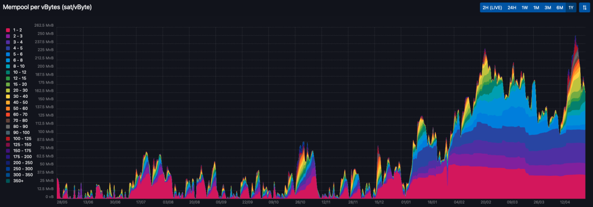
Figure 9: The Bitcoin mempool size over the last year (April 2020–2021) according to mempool.space.
The mempool is currently in a state where it hasn’t cleared in approximately five months, which means that, when any miner created a new block during that time span, they had plenty of unconfirmed transactions to include in the block. A logical conclusion is that miners are financially incentivized to include the unconfirmed transactions that are offering the highest transaction fee to reward the miner for including their transaction, which is indeed how most of the current miners operate.
As a result, unconfirmed transactions with a high transaction fee are included in new blocks first, while transactions with a low fee remain stuck in the mempool longer. This is visible in figure 7, where the mempool is currently particularly filled with unconfirmed transactions that pay a fee of 1-5 satoshis per vByte, while the mempool is regularly cleared from transactions of a higher fee rate.
An implication of this mechanism is that, during busy times on the network, anyone that is looking to make an on-chain transaction on the network needs to bid up their transaction fee to get their tiny share of block space on the Bitcoin blockchain that is needed to get their transaction confirmed. As such, a block space market (sometimes called “fee market”; which is technically incorrect because the block space on the Bitcoin blockchain is being bid on) develops.
Since the value of the transaction fees that are included in Bitcoin blocks essentially represents the magnitude of this developing block space market, it is a better proxy for network activity than simply looking at transaction counts. Figure 9 visualizes the average bitcoin transaction fees in United States dollars (USD) over time, overlaid by the BPT metric that we introduced before. In anticipation of each halving, the average transaction fee is already gradually increasing, but its growth particularly accelerates when the bitcoin price increases after each halving. After the market cycle reaches a blow-off top and prices start to cool down again, network activity decreases again and finds a new equilibrium when the overall bitcoin market cycle bottoms out.
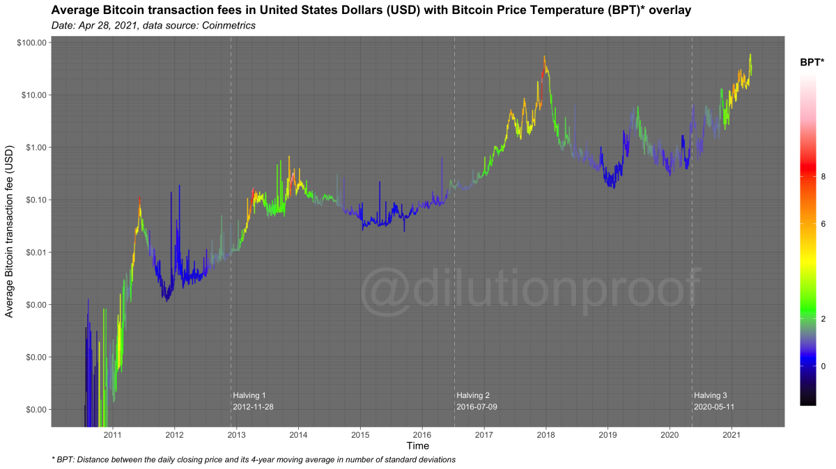
Figure 10: The average bitcoin transaction fees in United States dollars (USD), overlaid with the Bitcoin Price Temperature (BPT).
Besides the cyclicality, a clear, increasing trend in the average bitcoin transaction fees can be observed in figure 9. While this may seem like a bad thing (don’t we all prefer to pay less for transacting?), this is actually of the utmost importance for Bitcoin’s long-term existence. After all, if the block subsidy declines every four years and at some point in the future disappears altogether, miners still need an incentive to keep mining and process transactions.
The Contribution of Transaction Fees to the Block Reward
Figure 11 visualizes the percentage in which transaction fees (red) and the block subsidy (blue) account for the overall block reward that miners receive when creating a block. When first glancing at these percentages on a continuous scale (top figure), it seems like transaction fees are relatively irrelevant, as the block subsidy has accounted for the vast majority of the block reward during all of Bitcoin’s history. While this is true, when these percentages are displayed on a logarithmic scale (bottom figure) , it becomes more apparent that over time, there is actually a clear upward trend in the degree to which transaction fees play a role in the block reward. On a cycle-by-cycle basis, you can even see that the percentage increases by roughly an order of magnitude, underlining how large this growth actually is.
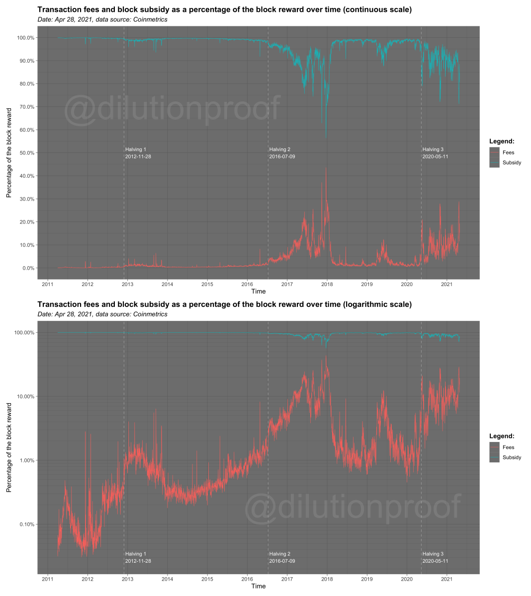
Figure 11: Transaction fees and block subsidy as a percentage of the block reward over time on a continuous (top) and logarithmic scale (bottom).
While it is difficult to predict exactly when the point will be reached where transaction fees will (consistently) account for the majority of the block reward (based on eyeballing the charts above; perhaps after one to three more cycles?), as long as there is at least some activity on the Bitcoin network, it is a given that this point will be reached at some point in the future because the block subsidy trends toward zero by design.
When this point is reached, there is one more incredibly important question that we’ll get an answer on: will the hash rate on the network stay relatively stable at a level that is sufficient to guarantee the network’s overall security? If the answer to that question is “yes,” Bitcoin will have passed the biggest test in its existence and have passed the final exam toward its full maturity. Perhaps it could even be the point where the Bitcoin Core software versioning is upgraded toward 1.0 and above. While we cannot establish with absolute certainty that the question above can ultimately be answered with “yes,” a case can be made to be optimistic about the outcome, as was done by Dan Held in this May 2019 article.
This brings us to the final part of this article, where we’ll hypothesize how that perspective would impact the four-year cycle, and what that future for Bitcoin would look like.
How a Healthy Block Space Market Will Kill the Four-Year Cycle
The subtitle of this article already gave away the direction of my take on this: when Bitcoin gets to the “full maturity” mentioned above and a healthy block space market exists that is able to sufficiently incentivize miners to structurally keep the lights on, I expect the four-year cycles as we know them today to fade into oblivion.
The easiest way to substantiate this claim is to fast-forward all the way to the late 2130s, when Bitcoin’s block subsidy is estimated to run out. In the absence of a block subsidy, 100% of the new demand for bitcoin will have to be satisfied by purchasing bitcoin from existing holders (and to some extent miners that sell some of their fee revenue to pay for expenses, which will likely be just a fraction of the total supply that is available for sale on the market), creating a perfectly inelastic situation where price changes become a perfect reflection of changes in demand for bitcoin. To visualize this end state, @Croesus_BTC’s visualization of the demand/supply mechanic has been adjusted to this new situation in figure 12.
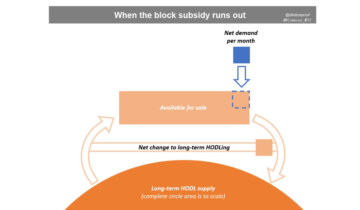
Figure 12: @Croesus_BTC's visualization of the supply/demand mechanism in Bitcoin, updated for the scenario in which the block subsidy has run out.
Now that we have established that the halving cycles will, by design, end at some point during the next ~118 years, it is helpful to rewind to the present and assess what the short-term path toward that end state will look like in the near future.
To understand those implications, it is important to grok that the relative impact of each halving on the block subsidy is the same (block subsidy divided by two), but the absolute impact of each halving on the block subsidy decreases over time. For example, the fourth-annual inflation rate dropped by -50% in 2012, but then by -33.3% in 2016, -9.6% in 2020 and will drop by just -3.8% in 2024, -1.7% in 2028 and -0.8% in 2032. More simply put, the larger the percentage of bitcoin’s finite supply has already been issued, the smaller the impact of a change in the remaining issuance rate on the supply that is already circulating on the market.
Now that we have established that the block subsidy is literally designed to decay into oblivion over time, the final step is to understand when the halving of the block subsidy will indeed start to lose its relevance.
The way I see it, this probably won’t be attributable to a single point in time, but it will be a gradual process that will happen when transaction fees overtake the block subsidy as the primary source of miner revenue (figure 13). After all, the smaller the contribution of the block subsidy to the portion of the miner revenue becomes, the smaller the impact of halvings will be on the supply that is available for sale on the market.
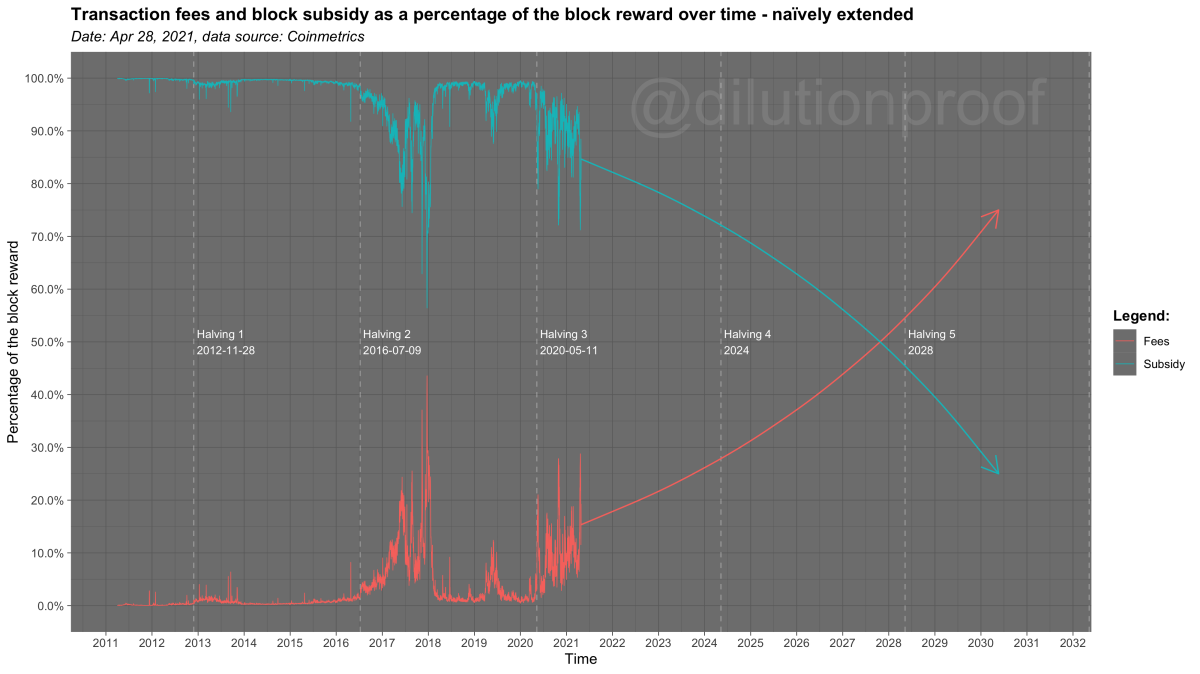
Figure 13: When transaction fees overtake the block subsidy as the primary source of miner revenue, the effect of the halvings on bitcoin's four-year market cycle can be expected to decay.
How the Death of the Four-Year Cycle Will Impact Bitcoin’s Future
When the earlier described process has progressed to a point where transaction fees have become the primary source of miner revenue and the four-year cycle has indeed decayed into irrelevance, it will impact bitcoin’s future in several ways.
First, the decay of the four-year cycle would mean that pricing models that depend on the assumption of a halving-related market cycle being present will lose accuracy and, at some point, break. This would apply to the Bitcoin Price Temperature (BPT) and BPT Bands that were discussed earlier but also for the popular S2F and S2FX models. The big question regarding the latter; would those models break to the downside (e.g., via diminishing returns as long-term volatility declines) or to the upside (e.g., via a steepening adoption curve and/or hyper-inflation-like event)?
Second, as the percentage of bitcoin’s finite supply that has already been issued increases, the bitcoin price becomes an increasingly pure reflection of the market demand for bitcoin. This means that in a long-term post-halving-cycle future, cyclicality in bitcoin will likely be more closely related to the actual economic activity of its market participants and thus their economic cycle (sometimes also called “business cycle”).
Third, if the bitcoin price increasingly becomes a pure reflection of the market demand for bitcoin, the likelihood of a dramatic exponential price rise past what we have seen so far increases. After all, due to the ever-decreasing supply issuance rate, demand for bitcoin has an increasingly direct influence on the bitcoin price. With gold, large increases in demand can be answered by increasing the supply rate via additional mining, but this is not possible in bitcoin—making it the ultimate hard money. If Bitcoin were to reach mass adoption and follow a similar technology adoption curve to what we’ve seen in the use of the internet or mobile phones (figure 14), the likelihood of a “supercycle” happening in the bitcoin price increases (or a mixture between that and its traditional four-year cycle as a more fluid transformation). Something similar to this has also been described by @Croesus_BTC in a June 2020 Twitter thread.

Figure 14: Dr. Everett Rogers’ 2003 diffusion of innovations theory.
Fourth, another consequence of the absence of a four-year cycle as we know it could mean that the bitcoin price eventually becomes less volatile. As was recently pointed out in a note by JP Morgan, that development would be a positive for institutional interest in the asset, which would further validate it as a macro store of value.
Finally, if a healthy block space market will indeed kill bitcoin’s four-year cycle, it means that transacting on the Bitcoin blockchain will likely have become quite expensive. This means that in the future, most of us won’t be transacting via the Bitcoin base layer on a regular basis. More likely, the block space fee pressure will incentivize more effective batching of transactions (or, as Nic Carter put it during Baltic Honeybadger 2018, “container ships, not parcels,”) and broader adoption of layers (e.g., the Lightning Network) that have been built on top of Bitcoin’s base layer, which most of us will probably primarily use to interact with bitcoin, aside from occasional channel opens or closes or large transactions.
Special thanks go out to @GeertJancap for the useful feedback on the draft of this article. Follow @dilutionproof on Twitter for continued discussion on this topic. Disclaimer: This article was written for educational and entertainment purposes only and should not be taken as investment advice.
This is a guest post by Dilution-proof. Opinions expressed are entirely their own and do not necessarily reflect those of BTC, Inc. or Bitcoin Magazine.


