On November 10, 2021, bitcoin hit its all-time high price of $69,000, per the Bitstamp exchange rate.
It is truly an incredible event that BTC was able to climb so high, increasing the asset’s total market capitalization to $3 trillion, according to CoinGecko. But not so long ago, in June and July of this year, the situation didn't look so rosy. BTC was relatively weak, at least such an impression could have formed for many, and at some point, it even seemed that BTC could test the lower levels of $12,000 to $16,000.
And there were some other developments that may have made investors nervous at this time, like the claims of Chinese regulators, close attention from the U.S. regulators, the propensity of retail investors to continue panic selling, and so on.
But what the first cryptocurrency has taught us for sure is that price is difficult to predict. So, what should we be guided by? There are many great trading strategies out there, but today I propose analyzing bitcoin using on-chain supply metrics.
In my opinion, the supply metrics have performed well in the current rally, and I think they will continue to generate valuable signals for us, which are suitable for analysis.
Let's look at two approaches to analyzing BTC using supply in profit/loss metrics. But first, let me remind you of the meaning of the terms.
Percentage of BTC supply in profit: This is the percentage of the circulating supply in profit, or in other words, the percentage of existing bitcoin for which the price during their last movement was lower than the current BTC price. Usually, when an overwhelming percentage of the total BTC supply is profitable, this means that the market is experiencing a bullish cycle or is about to see a bullish rally. The period during which coins can profit can range from several weeks to months before any noticeable bearish correction occurs in the market. The indicator is based on the UTXO value.
Percentage of BTC supply in loss: This represents the absolute amount of bitcoin in a given network currently in loss (i.e., when they were last moved, their price was higher than the current BTC price). This metric helps highlight market bottoms by suggesting when investors might be ready to re-enter the market. The percentage of BTC supply in loss doesn't account for the amount of loss. This metric is also based on the UTXO value.
Analyzing BTC Supply In Profit/Loss Using Technical Trend Lines
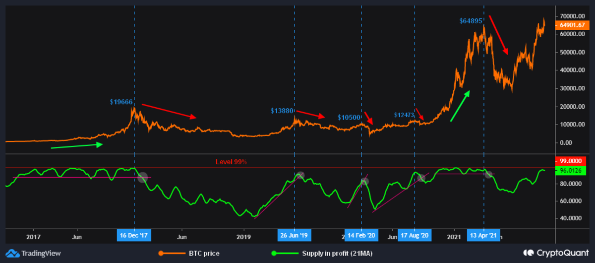
As a basis for this method, I took the net percentage of BTC supply in profit/loss metrics. I applied an additional setting in the form of a 21-day simple moving average to avoid the display's sawtooth effect and analyze it more conveniently. Anyone can make identical data settings in an account of a blockchain data provider such as Glassnode, CryptoQuant, etc.
After configuring the indicator, it is necessary to apply the technical analysis method, specifically, the trend lines. By the way, I have hardly ever seen traders start using trend lines on the on-chain data. In my opinion, this is a significant oversight, as we can get very effective signals by doing so.
Interpreting The Bitcoin Supply In Profit
When the profitable supply is consistently in a range between 90% and 99%, it means that BTC tends to start parabolic growth. When a profitable supply curve breaks down its trend lines (marked with light gray circles), it suggests that bitcoin has completed its global or local growth and will soon move to a decline.
Most often, the maximum price of bitcoin and the moment when the supply curve breaks through its support differs by several days. There are also times when the profitable supply curve rises to levels close to 90% to 99% and doesn't stay there for a long time, after which the trend line is broken, and the BTC price begins to drop.
You can check the chart below:

Source: CryptoQuant
Interpreting The Bitcoin Supply In Loss
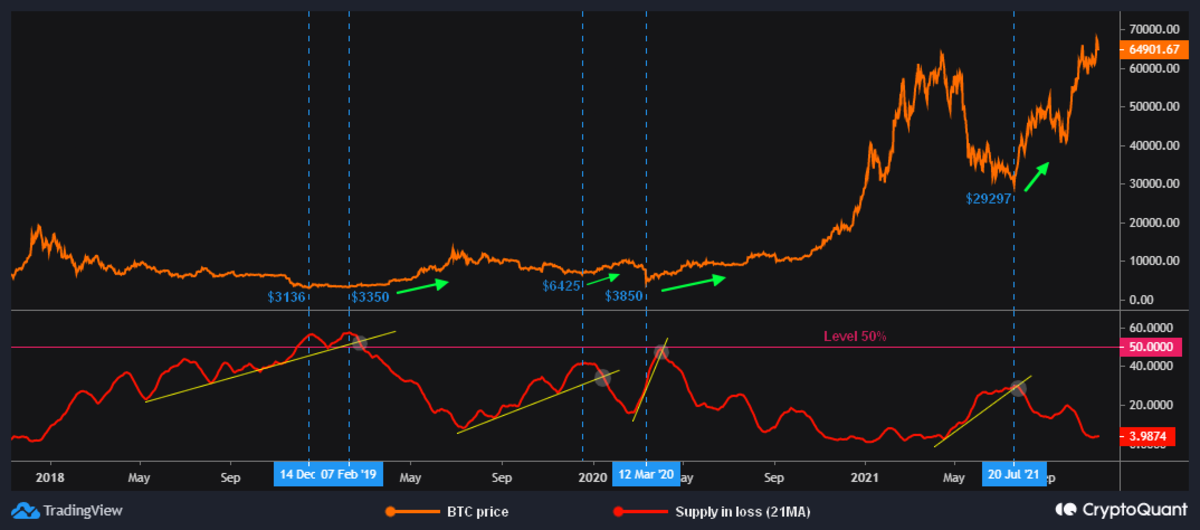
On the example of unprofitable supply, one can see that the significant level for losses is 50%. The supply curve is practically never higher and doesn't have periods of bright consolidation.
The supply-in-loss metric (on a 21-day moving average) allows us to state surrender zones in which signals to buy BTC are generated (light gray circles). The method of using trend lines is identical to the above example with profitable supply. It should be noted in an example dated July 29, 2021, where the metric's value didn't reach the required level of about 50%. There, what I call the "intersection" of the curves of profitable and unprofitable supply occurred, which provided the buy signal because of traders' capitulation.

Source: CryptoQuant
The application of this method seems to be useful not only for long-term analysis but is also excellent for short-term and medium-term analysis as well.
Assessing The Net Percentage Of BTC Supply In Profit/Loss
From time to time, in the vastness of the cryptocurrency community, I come across the opinion that the percentage of BTC supply in profit being over 90% is a bearish factor. I understand why some people can have such an opinion, but it is not entirely true.
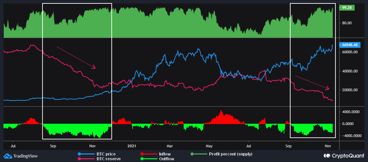
To know whether a profitable supply is bullish, we need to compare it with BTC exchange reserves, as well as inflow/outflow (NetFlow). This method is more suitable for medium- to long-term understanding of bitcoin price action.
The conditions of the bullish model are as follows:
- Significant outflow of BTC from crypto exchanges
- Declining BTC reserves;
- Profitable supply above 80% to 90% on average
The chart below shows a couple of such examples (white rectangles areas), where all the conditions for a bull run are met.

Source: CryptoQuant
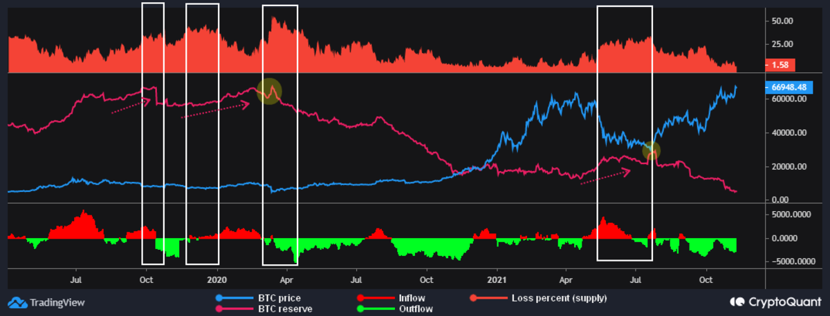
In all other cases, when there is no significant outflow of BTC, or even if there is an inflow of different strengths, and the growing reserves of BTC on the cryptocurrency exchange is seeing a simultaneous increase in unprofitable supply, this indicates a bearish mood of traders. After that, trader capitulation often happens (indicated by light yellow circles below), demonstrating the reaching of a local or global bottom.

Source: CryptoQuant
In conclusion, I would like to say that until now, many professional traders and newbies in the cryptocurrency world keep ignoring the value of blockchain (on-chain) data. It seems that on-chain data (primarily related to supply metrics) deserves more attention and deeper study, since this data has performed well in the current bull rally. I think these metrics will continue to show themselves to be valuable in this way.
This is a guest post by Baro Virtual. Opinions expressed are entirely their own and do not necessarily reflect those of BTC Inc or Bitcoin Magazine.


